Wondering which shade, tint, hue or tone will work best in your bathroom? Our resident expert Ruth gives her opinion on the colours of the year 2023.
It’s that time again—when the leading global authorities on colour launch their new “colour of the year” for the next 12 months. So, what do the likes of Dulux, Graham & Brown and even us think will be the colour of the year for 2023? And how can you make this work in your bathroom?
Before you read on, it’s worth first understanding what a "colour of the year" actually is. Pantone, the leading worldwide authority on all things to do with colour, began naming a colour of the year back in 2000. The idea was that each colour would capture the spirit of the moment, reflecting the world around us. Examples of this are their 2022 colour of the year Very Peri (pictured below), a red violet-infused blue that was symbolic of the changes many of us were going through as we came out of the global pandemic. Before that, their 2021 colours of the year were Ultimate Grey and Illuminating, which aimed to bring hope and optimism to a world which had been turned upside down.
Pantone colour of the year 2022 was Very Peri
As the years rolled by, many other experts in colour have followed suit, launching their own colours of the year with much fanfare (you can find out more about these further down this article) Now you know a little more about colour of the year, let’s take a look at each one and see how you could use them to great effect in your bathroom.
Simply read on or click any of the links below to jump to a relevant section:
- Dulux: Wild Wonder
- Graham & Brown: Alizarin
- Sherwin Williams: Redend Point
- Behr Paint: Blank Canvas
- Pantone: Viva Magenta
- Victoria Plum’s colour of the year 2023
- Previous colours of the year
- Working with colour: further ideas and advice
Dulux: Wild Wonder
For many years now, a team of trend and colour experts at Dulux have been forecasting a colour of the year that captures the current mood of the world. For 2023, Dulux has chosen “Wild Wonder”—a bright, sunny tone that is first and foremost a warm, neutral shade. Taking inspiration from the natural world, this glowing colour exudes positivity. Whilst Wild Wonder is uplifting, it is also very calming and slightly muted, lending itself well to interiors.
Surrounding yourself with colours inspired by nature, especially in your home, is a very grounding experience that can ease stress levels (something that is extremely important in these testing times). Nature helps us return to our roots and the essentials in life, and colour psychology can impact this greatly.
Dulux describes the origins of Wild Wonder as a thoughtfulness for the natural world being at the top of our global agenda. This soft, yellow-toned shade is said to encapsulate the inspiring characteristics of nature, as well as its transformative powers. For these reasons, Wild Wonder brings a sense of magic into the home. So, the question is, how can it be incorporated into the bathroom?
Dulux colour of the year 2023: Wild Wonder
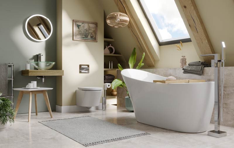
To achieve this, we have paired it with Dulux’s “Old Time Olive,” a soothing, muted olive green, that the brand has suggested is a perfect match to their colour of the year. When brought together, the 2 colours offer a tranquil softness that creates the most beautiful space to relax and unwind in. Your bathroom is certainly a practical space, but it should, just as importantly, be a place of solitude and escapism. Wild Wonder creates the ideal palette for just this purpose.
And, if it’s ultimate relaxation you’re seeking, why not include the Mode Hardy slipper freestanding bath? Along with a wall mounted countertop basin and toilet, you’re guaranteed to love the clean lines and contemporary minimalism.
Featured products:
- Mode Hardy freestanding single ended slipper bath
- Mode Foster freestanding bath tap
- Mode Tate wall hung toilet with soft close seat
- Mode Orion oak wall hung countertop basin shelf
- Mode Mackintosh clear glass countertop basin
Graham & Brown: Alizarin
Alizarin is a red pigment found in the Rubia plant species, often used for dyeing textiles. For 2023, Graham & Brown have identified this shade as a rich, on-trend colour with warm and uplifting tones, yet an air of drama and luxury. It’s thought that this opulent, natural shade of red will transport you to the exotic lands from which Alizarin originates. It can be used in both smaller and larger spaces, depending on the kind of feeling you’re looking to create. For example, in a smaller space, it will offer a cosy, cocooning effect, whilst in a larger space, it can be used to inspire a sense of luxury and opulence.
Alizarin is an incredibly inviting shade which can be used in harmony with Graham & Brown’s Design of the Year 2023 (the wallpaper design they launch annually in conjunction with their colour of the year). For 2023, the brand has named “Florenzia Dusk” as their Design of the Year—a timeless, floral pattern that picks up on the uplifting feeling associated with Alizarin. Both Florenzia Dusk and Alizarin symbolise restoration and regeneration through their connection to the natural world.
Earthy tones provide an ever-growing and popular palette for the home, and Graham & Brown’s colour choice lends itself stunningly to this category. Like Wild Wonder, Alizarin offers something different and a touch livelier when compared to the usual shades associated with nature, like browns and creams. Inspired by rust tones, it can be used as an all-over paint for a bold yet traditional feel, or as a pop of vibrancy throughout the home.
Graham & Brown colour of the year 2023: Alizarin
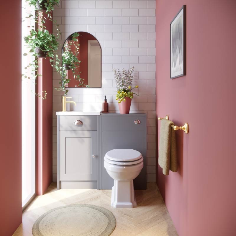
To help demonstrate how this deep, moody colour could be used in what is likely the smallest room in the home, we’ve chosen to use it in a downstairs (or cloakroom) bathroom.
The space pictured above, quite conveniently has access to lots of natural light. This beautifully lifts the auburn, producing a cocooning effect without darkening the room too much. And, to ensure we maintain this light feel, we’ve created a feature wall to the rear using a light grey, marbled wall panel. To add to the sense of opulence, we’ve used the Orchard Dulwich stone grey cloakroom combination unit, plus ornate accessories from our 1805 Antique Gold range.
Featured products:
- Orchard Dulwich stone grey cloakroom combination with white wooden seat
- Accents 1805 antique gold single towel rail
- Mode Spencer round brushed brass basin mixer tap
- Showerwall MDF tacoma marble proclick
Sherwin Williams: Redend Point
US paint company Sherwin Williams have announced “Redend Point” as their colour of the year for 2023. There is a strong theme across this year’s colour trends, as almost every single one is described as having derived from nature and taking influence from the natural world to help us feel more connected to the great outdoors. This particular shade is a blush-beige mid-tone—a warming neutral that, again, offers an alternative to the common brown and cream neutrals we often see.
Redend Point has a soft, pink-ish undertone that Sherwin Williams describes to be “soulful-yet-subtle”. The desert-inspired hue is minimal, calming and intriguing, and considered to be “not too light or too dark, not too moody or too sweet”. The beauty of this shade is the variety of ways in which it can be used effectively. It can act as a colourful counterpart to cooler, more muted shades, such as stone greys, or it can balance and tone down bright, bold shades.
This inviting, versatile colour is utterly perfect for the bathroom due to its calming nature. Sue Wadden, Sherwin Williams’ Director of Colour Marketing, says that Redend Point revealed itself as a clear choice for their colour of the year due to a natural incline in warming, energising neutrals—a theme we’re certainly seeing throughout the 2023 colour trends. Sue goes on to say that, ultimately, Redend Point speaks to the warmth of the empathy and “care culture” we have been experiencing in recent times.
Sherwin Williams colour of the year 2023: Redend Point
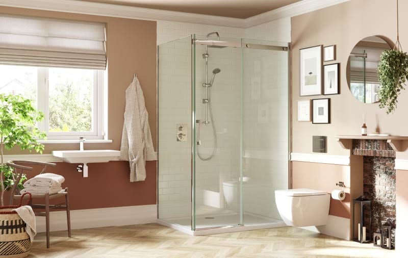
For rich contrast, we’ve partnered Redend Point with 2 other Sherwin Williams colours, “Canyon Clay” (the warmer, rust colour on the lower walls), and “Ibis White” (the off-white shade that the skirting boards have been painted in). The overall feel of the space is one that is light and clean whilst also being soft and welcoming.
Featured products:
- Mermaid metro tile effect pure white waterproof shower wall panel 2420 x 1200mm
- Mode Ellis short projection wall hung toilet with soft close seat and wall mounting frame with push plate cistern
Behr Paint: Blank Canvas
Behr’s Colour of the Year, “Blank Canvas”, is by far one of the most versatile shades forecasted for 2023. This subtle, minimal hue should not be underestimated, and, in my opinion, is a strong contender for one of the most popular interior design colour trends in the coming year. The paint company aptly describe it as “a hopeful and welcoming warm white with limitless possibilities”. Blank Canvas is a great choice if you’re colour-shy, or if you’re looking to emulate a clean, contemporary home with a classic Scandinavian warmth.
Think of Blank Canvas as a symbol for a fresh start. The Architectural Digest beautifully describes it as being a shade that “straddles the line between past and future”, and the colour lives up to its title as a blank canvas for people to find and express their creativity and clarity. As it’s not a loud, colourful hue, it’s wonderful for combining and experimenting with unusual, intricate patterns and interesting textures.
Behr Paint colour of the year 2023: Blank Canvas
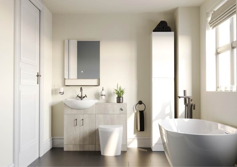
As you can imagine, this warm shade of white pairs well with an endless array of colours, but we’ve decided to show you how to keep it simple for a minimal, contemporary look. To achieve this sleek, modern feel, opt for other subtle neutrals and light, natural materials, such as this Oak furniture combination unit from our Orchard Bathrooms Lea furniture range. We’ve chosen black accents to give the space more visual interest and edge, which can be seen in the tapware and accessories. We’ve incorporated furniture in a differing finish to the oak unit, including a white tall storage unit from the Reeves Wharfe furniture range, for an eclectic look and feel.
Featured products:
- Orchard Lea oak furniture combination with black handle and Contemporary back to wall toilet with seat
- Reeves Wharfe white tall storage unit
- Mode Tate black basin mixer tap
- Mode Ashida freestanding bath
- Mode Foster black freestanding bath tap
Pantone: Viva Magenta
Pantone’s Colour of the Year for 2023 is Viva Magenta. This vivacious, red-toned shade, is full of life, bold and zesty.
Each year, Pantone carefully follow the mood of, and the happenings within, society, before aptly predicting a colour that captures this. They say that this particular colour is brave and fearless, expressing a new signal of strength. Whilst making a loud statement, Viva Magenta is also comfortingly rooted in nature, which is something it has in common with many of the upcoming colour trends we are seeing. Pantone go on to describe their Colour of the Year as being an “animated red that revels in pure joy, encouraging experimenting and self-expression without restraint”.
Viva Magenta is electrifying, boundaryless and empowering. It is inspired by the red of cochineal (a precious natural dye), which, incidentally, is one of the strongest and brightest natural colours on the planet. This warm and uplifting shade aims to ignite inner strength, making it the perfect option for creativity and experimentation in the home.
Pantone Colour of the Year 2023: Viva Magenta
Nowadays, we’re so used to seeing bathrooms that use very calming, neutral shades, as we continue to transform these spaces into spa-like sanctuaries. However, Ideal Home recently stated that we’re beginning to see people being bolder with their colour choices. If you are someone who enjoys maximalist interiors, then Viva Magenta may be the colour for you.
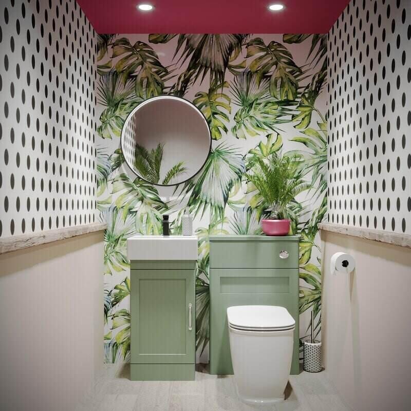
In our relatively spacious cloakroom design (above), we’ve introduced a variety of exciting patterns and colours, painting the ceiling with Viva Magenta and matching the shade with accessories, like the plant pot. Whilst this can be a slightly more difficult shade to incorporate into your bathroom design, we feel the results are well worth the effort.
If you’d like to combine two bright colours in your home, a good rule of thumb is to mix one cool and one warm (you can find out more about cool and warm colours in our guide to using a colour wheel).
Here, we’ve chosen to contrast Viva Magenta with Nordic Green bathroom furniture from The Bath Co. Aylesford range. In terms of loud patterns, we’ve opted for a tropical shower wall panel feature wall and monochromatic polka dots. Of course, if this isn’t your kind of style, and you’d prefer something more minimal, we recommend introducing the colour in smaller aspects, through towels and other accessories.
Featured products:
- The Bath Co. Aylesford nordic green floorstanding vanity unit and ceramic basin 400mm
- The Bath Co. Aylesford nordic green back to wall unit 570mm
- The Bath Co. Beaumont back to wall toilet with soft close seat
- Showerwall Custom Botanical acrylic showerwall panel
Victoria Plum’s Colour of the Year 2023
As ever, here at Victoria Plum we wanted to put our own stamp on the 2023 colour trends. Being bathroom experts, we have watched many colours for bathrooms come in and out of fashion over the years. Last year, we predicted “Plaster Pink” as our colour of the year 2022. This was a shade that sat amongst other unusual shades from the natural world, that we might not always associate with nature—think of pigment colours, historically used in ceramics and textile dyeing, like burnt orange, spiced ochre and charcoal black.
This year, we’ve taken deep inspiration from Dulux’s “Ancient Artefact”, and have decided to name this strong, earthy hue as our colour of the year 2023. Our main reason for selecting this is an increasing popularity in warm, unusual neutrals combined with the stability and strength that this shade represents—2 key characteristics that are deeply valued in these tumultuous times.
Varying shades of brown symbolise so many of life’s familiar comforts and delights, from the pebbles on a beach to a warm hot chocolate on a cold evening. This particular colour is subtle yet distinctive, like many of the other colour trends predicted for 2023, and its versatility means it can be paired with light, airy tones for a Scandi-style, or with richer shades of a similar category (including Graham & Brown’s Alizarin) for a cosier feel.
Victoria Plum’s colour of the year 2023: Ancient Artefact
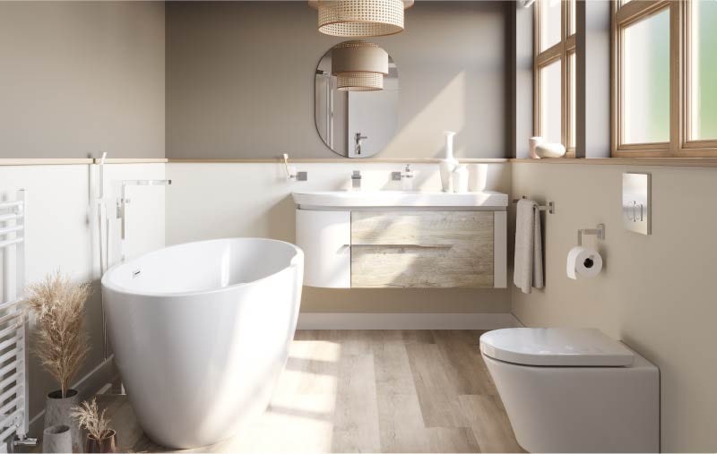
Here, we’ve used this shade on the upper walls, paired with a balancing, lighter neutral on the lower walls for variation and visual interest. Overall, the space we’ve created is very soothing, just as any great bathroom should be. This bathroom has a strong Scandinavian influence that is demonstrated through light woods, a rattan-style light shade and minimal, contemporary products that focus simply on the beauty in fundamental shapes and design.
Featured products:
- Mode Harrison freestanding contemporary bath
- Mode Burton white & rustic oak wall hung vanity unit and basin
- Mode Tate wall hung toilet with soft close seat
- The Heating Co. Phoenix white heated towel rail
Previous colours of the year
For further inspiration, why not take a look at the colours of the year from recent times? Simply click on any of the links below.
- Colour of the year 2024
- Colour of the year 2022
- Colour of the year 2021
- Colour of the year 2019
- Colour of the year 2018
- Colour of the year 2017
Working with colour: further ideas and advice
I hope you enjoyed reading this article as much as I enjoyed writing it. If you’re still wondering which colours to choose for your bathroom, we’ve plenty more inspiration and expert advice here at Victoria Plum. Why not find out how to use a colour wheel and create a coordinated colour palette for your bathroom? We’ve also got some top tips on choosing your bathroom colour, not to mention colour ideas for small bathrooms.
If you already have a general colour in mind, be inspired with the following articles:
- Great grey bathroom ideas for 2023 and beyond
- 8 beautiful blue bathroom ideas
- 5 refreshing green bathroom ideas
Whatever colour you choose, don’t forget to complement with products from Victoria Plum for your very own picture-perfect bathroom. Enjoy!

